These are texts I wrote for the catalogues of Goldens Auction House and Corpus Fine Art, the kind of writing behind my artwork attribution and provenance research. Each one places a work in its period, identifies the hand and the influences behind it, and explains what a collector is actually looking at. This is research and writing, not formal authentication. The pieces range from a 17th-century Caravaggio follower to a contemporary Ukrainian canvas, with porcelain, silver, and furniture in between.
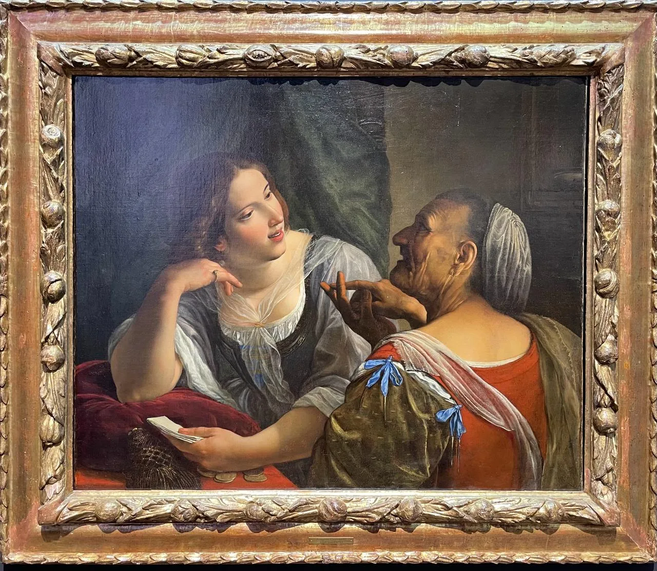
Angelo Caroselli, “Allegory of Youth and Old Age”
First half of the 17th century. Oil on canvas, 65.8 x 80 cm.
Angelo Caroselli is a bright representative of the Italian school of painting, although, ironically, he did not have any “school” behind him. He is considered one of the most talented Caravaggio followers, even though Caravaggio was his contemporary. At the same time, Caroselli won his fame not because of a unique manner or a certain peculiarity of creativity.
A typical representative of the Baroque era, he devoted his paintings to mythopoetic and biblical themes. He frequently painted temples and, less often, portraits or paintings on everyday subjects. Above all, Caroselli proved himself as an incredible copyist of more famous masters. For example, he could exactly repeat the manner of Poussin. His forgery was so skilful that once Caroselli managed to sell a “Poussin” canvas (The Plague of Ashdod) by his hand even before the original was completed.
Actually, an incredible level of skill is the artist’s visiting card. “Allegory of Youth and Old Age” demonstrates this well. The canvas belongs to his “Allegories” cycle. Caroselli’s use of dramatic chiaroscuro in this canvas expresses the drama of the juxtaposition of the two figures. It highlights the stark contrast between the soft, youthful figure on the left and the more wasted character on the right. Clearly influenced by Caravaggio’s new naturalism, which prevailed in Rome until 1606, Caroselli’s technique also resonates here with the work of Orazio Gentileschi, who worked in the Italian capital at the turn of the 17th century in a similar style.
Written for the catalogue of Corpus Fine Art.
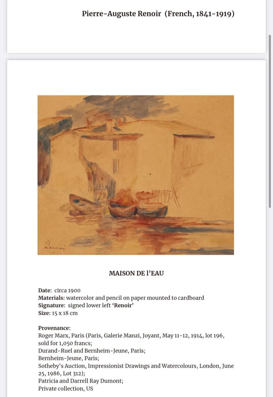
Renoir, “Maisons Au Bord”
Watercolour.
Throughout the entire period of his work, Renoir moved away from and came back to impressionism. Despite the fact that he is included in the list of the most famous impressionists, he belonged to the movement rather for formal reasons, but not according to the principle of his creativity.
Impressionists were not interested in psychologism, immersion in the inner world, or the nature of things. Their focus was on the moment, the impression and its fixation. This determined the genre feature of impressionism, in which landscapes prevailed. Renoir, instead, was more interested in a person, his or her mood, character, and state of mind. In search of methods of their representation, Renoir often returned to a realistic manner, but he is nearly the only artist who managed to make deeply psychological, yet at the same time impressionistic, portraits.
The “Maisons Au Bord” watercolour was made at the crossroads of two significant periods of Renoir’s work: “mother-of-pearl” and “red.” He managed to write many sketches. Most of them are oil, so watercolour works are quite rare in the author’s work. The main principle of his sketches was that the work should never end up in the workshop. It had to be finished and not refined later, because then the work would lose its impressionistic “liveness.”
The work is done in a manner of lightness characteristic of Renoir. Despite the large number of composite structures, houses, boats, piers, water and sky surfaces, there is a large amount of air in it. The strokes are loose and rather conventional. The artist seems to outline the figures, which, however, are revealed down to the specifics already in the fragments of their silhouettes. It can be assumed that the purpose of starting work on a specific landscape was to determine the shadow accents of the composition.
Using only two colours, blue and red (brown), the artist manages to convey the evening coastal calm of the pier.
Written for the catalogue of Goldens Auction House.
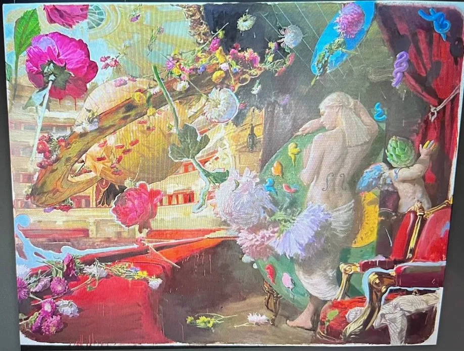
A. Savadov, “A Night at the Opera”
2023. Oil on canvas, 230 x 300 cm.
Art is the most sensitive plane that reflects every social breakdown. The Great War affects each of us, but Ukrainian art is one of the first frontiers of collective consciousness that took the blow and was deformed by the disruption of stability. “A Night at the Opera” is Savadov’s first work created at a certain chronological distance from previous projects. In terms of form, this canvas fits perfectly into the stylistic paradigm of Savadov’s painting. It is completely consonant with the ideas of the trans-avant-garde as an art beyond ideologies.
In 2023, taking into account our current context, “A Night at the Opera” acquires new significant representations. Each global upheaval requires a total rethinking of value grand-narratives, given that the previous system did not justify itself. The new sincerity in Savadov’s work is the artist’s desire to fix himself in a point of calm, which will replace the depicted chaotic dynamics. The trans-avant-garde escape from reality is paradoxically embodied in the stylistic realism of the image.
Just a moment more, and the flowers that welcome the Muse will all fall at her feet. It is noteworthy that the Muse here is the patroness of all arts at once, which is indicated by her location and paraphernalia. The palette at her feet is about painting; lyrical poetry is symbolized by a little eros; drama is touched upon because the place of action is opera; and music is represented by her refined violin shape. The Muse here is the embodiment of something high and spiritual, but it is Saturn who pours flowers at her feet. This is yet another reference to Roman mythology. The god of fertility and the earth seems to be courting and seducing the Muse. He presents her with floral gifts as if demanding she give up art and return to the carnal, worldly, just as the reality we exist in today forces us to look down, hide from missiles, and worry about survival instead of living life to the fullest.
Written for the catalogue of Goldens Auction House.
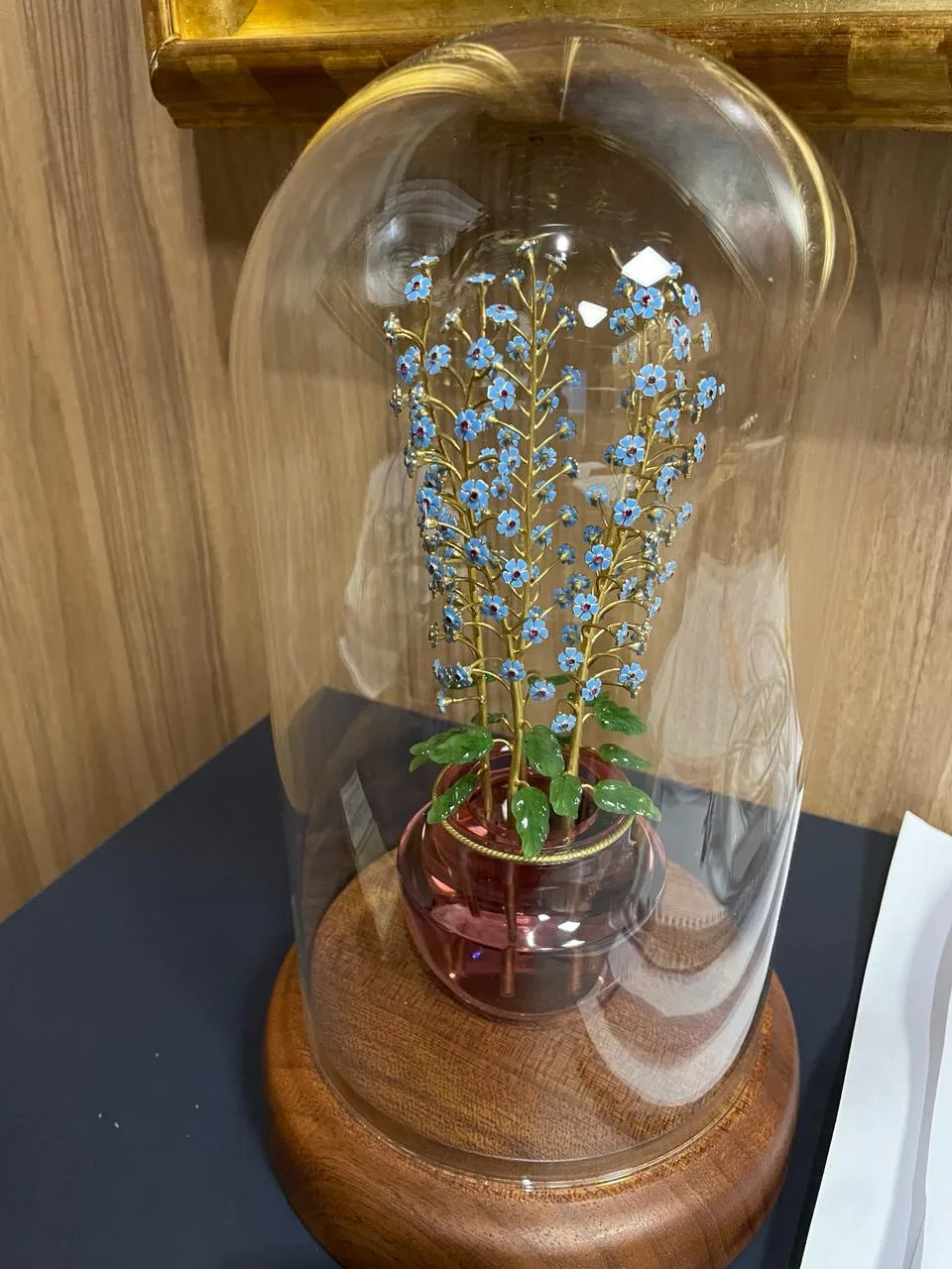
Serhii Korobka, “Forget-Me-Nots”
2021. Glass, jade, silver, hot enamels. Height 21 cm.
Fabergé craftsmen took special care to realize the idea of making “eternal” flowers from precious stones and metals. For each individual work to come close in its perfection to the creation of nature, the factory workers built a small greenhouse on the territory of their workshops, in which the most delicate and capricious flowers were grown. Next, a lot of time was devoted to the study of the smallest botanical details, which had to be precisely reproduced in each of the works. The owner of the production assessed this certainty with the help of a hammer. If it seemed to him that a flower was far from the natural original, he could break the entire product. Perhaps that is why Fabergé’s floral works impressed with their realism so much.
Today, technological possibilities have become much wider, which cannot but affect the improvement of works. Serhii Korobka, the author of the composition, no longer needs a home greenhouse to accurately reproduce botany; instead, he focuses on technical skill in working with precious metals and stones.
Fabergé’s project was absolutely in the spirit of modernism, for which the present-day artist is nostalgic, trying to convey the somewhat romantic ideas of the people of that time about the fragility of the world and the lyricism of nature.
A peculiar element of the composition of forget-me-nots is a vase in which the flowers are placed. This distinguishes Korobka’s work from the traditional compositions of Fabergé, who carved transparent vases from rock crystal that imitated filling with water. Here, the vase is of a pink shade. The stems of each of the flowers are made of gilded silver, and the smallest forget-me-not flowers are covered with blue enamel.
Written for the catalogue of Corpus Fine Art.
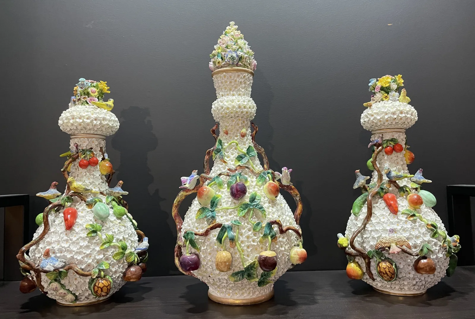
Set of Buldenezh Vases (3 pcs.)
Thuringia, Germany, second half of the 19th century. Porcelain, height 37 cm (pair) and 47 cm.
Thuringia is a region famous for its porcelain manufactories. Most of them were founded in the second half of the 19th century. Gradually, they moved from specialization in tableware to the production of more imaginative works of art like vases and purely decorative elements, such as figurines depicting people or animals, or even whole plot compositions.
Vases in the Buldenezh (fr. “boule de neige”) technique are an example of the highest craftsmanship in porcelain. This technique envisages a high-relief decoration in the form of hand-sculpted small flowers of a decorative viburnum type, which abundantly covered the surface of the product. It was made of soft frit porcelain exclusively by hand and required an extremely high level of professionalism.
In addition to a myriad of decorative flowers, each vase is decorated with fruit arrangements at the base and exquisite floral arrangements at the top. The detailing of decorative elements is also outstanding in these products, not only in plastic but also in colour solutions. Although the style itself gravitates more toward the opulence of a romantic or even rococo aesthetic, with its gilding and whimsical curves of fruit stems, the level of detail in each of the pieces is a convincingly realistic work of art.
Written for the catalogue of Corpus Fine Art.
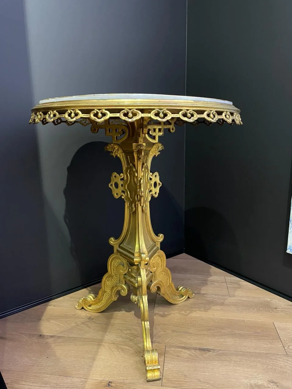
Gueridon Table
First half of the 19th century. Bronze, porcelain, overglaze painting. Height 88 cm.
Gueridons came into fashion in the era of the Napoleonic wars and reached the Russian Empire at the beginning of the 19th century. These small tables quickly became an integral part of life in aristocratic homes. They were used in hallways as a stand for candelabras and candlesticks. Vases with flowers, ladies’ handbags, or guests’ gloves were placed on them. Traditionally, French-style gueridons were made of solid rare wood; their legs were in the form of a dragon or a snake. A little later, different variations began to appear.
The name comes from a traditional French court dance, which had an element of play: while one participant held the torch, the others kissed in a circle. This is how the association about the gueridon as something that stands apart and independently was imprinted. Indeed, these tables are completely independent interior items and are usually not part of furniture sets, because they are valuable in themselves.
The Empire-style gueridon is made of gilded bronze. The style is indicated not only by the whimsical design of the base and table-top, framed with floral lace, but also by the covering of the table-top. Table-tops were traditionally made of marble or wood. Here we see a porcelain coating, complemented by a painting of a military campaign scene, which clearly indicates the era and place of origin of the object.
Written for the catalogue of Corpus Fine Art.
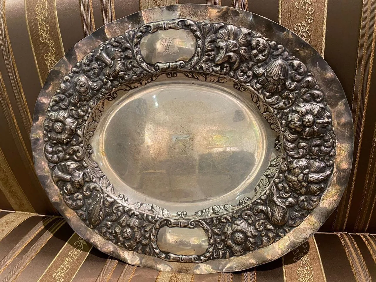
Silver Dish
Western Europe, late 19th to early 20th century. Length 44 cm, weight 700 g.
The tradition of silverware in Europe formed and developed exclusively within the royal courts. Next to porcelain, which has high technological and historical value and is a sophisticated marker of wealth and luxury, silverware was also in demand for the same reasons.
The evolution of silver products went through all the same stages as the visual art of European countries. Table silver had different forms and decorative elements. They depended on the period and the court the product was made for. However, the invariable sign on silverware is the hallmark. First of all, it indicates the purity and fineness of the material, as well as the marks of the master or factory where the dishes were made and, of course, a sign in the form of a coat of arms, anagram, or another mark that indicated the owner of the product.
The presented dish is in the style of romanticism. This is indicated by the lush floral decoration. However, the flowers and leaves engraved in the metal here are pretty massive; they do not have small details or subtle elements. This testifies not only to the era but also to the region: the dish was made in the North-Western part of Europe. The border is embossed, and the side accommodates two symmetrical shields, above and below, under the sign of the owner. On the upper framed shield, there is an anagram with the double letter “X” on it.
Written for the catalogue of Corpus Fine Art.